Project Brief
Client Requirement:
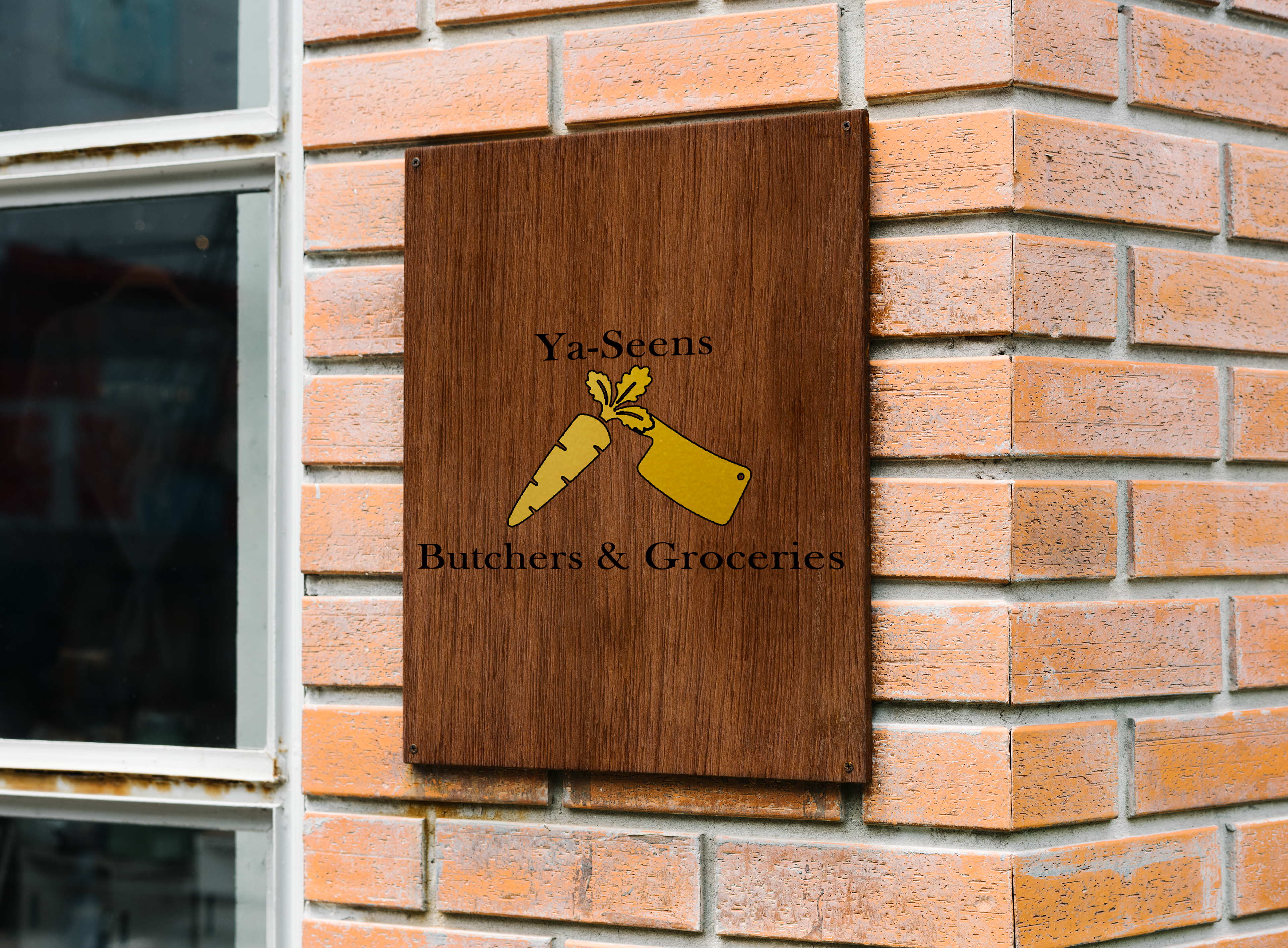
Our client seeks a distinctive logo that seamlessly incorporates both their grocery and butchers departments. The color scheme specified is Black and Gold.
Summary:
The design for this client holds significant importance, aiming to vividly portray the essence of their store that houses both a grocery section and a butchers department. The client desires a logo that captures the freshness of produce from the groceries and the skilled craftsmanship from the butchers.
Design Concept:
To encapsulate the dual nature of the client's business, we meticulously crafted a design that harmoniously integrates the elements of both realms. The focal point of the logo ingeniously combines the stem of a carrot, symbolizing the freshness of the grocery section, with the handle of a cleaver, representing the expertise of the butchers. This symbiotic fusion not only visually communicates the diverse offerings of the store but also serves as a memorable and iconic symbol for their brand.
Color Scheme:
In adherence to the client's preferences, the chosen color scheme is Black and Gold. This combination exudes a sense of sophistication and timelessness, ensuring that the logo stands out and leaves a lasting impression.
Our design approach is rooted in the client's vision, aiming to create a logo that not only reflects the individuality of each department but also communicates the seamless unity of the grocery and butchers facets within their establishment.

Ya-Seen logo placed on crew neck jumper for staff logo Mock-ups provided by asylab - www.freepik.com


